I was contacted by Broken Sword Publications to do spot illustrations and book design for this project. The book features essays, short stories and poems about lowriders and lowrider culture, but its main focus is the amazing photography of Art Meza.
I decided that I wanted the focus to be on the photographs, and that everything else should look crisp and light with simple typography and generous amounts of white space.
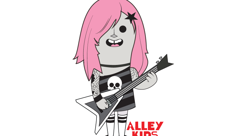
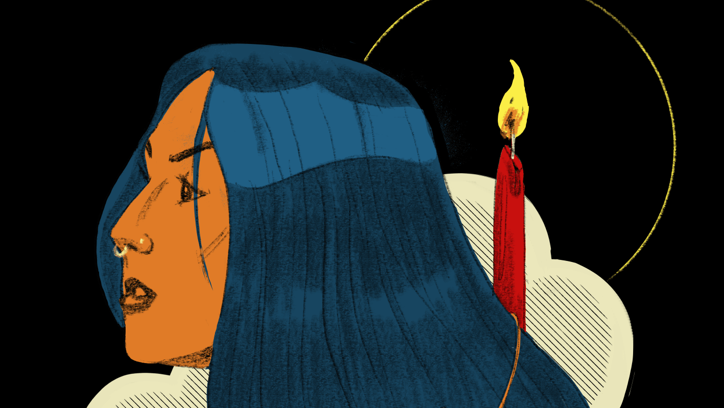
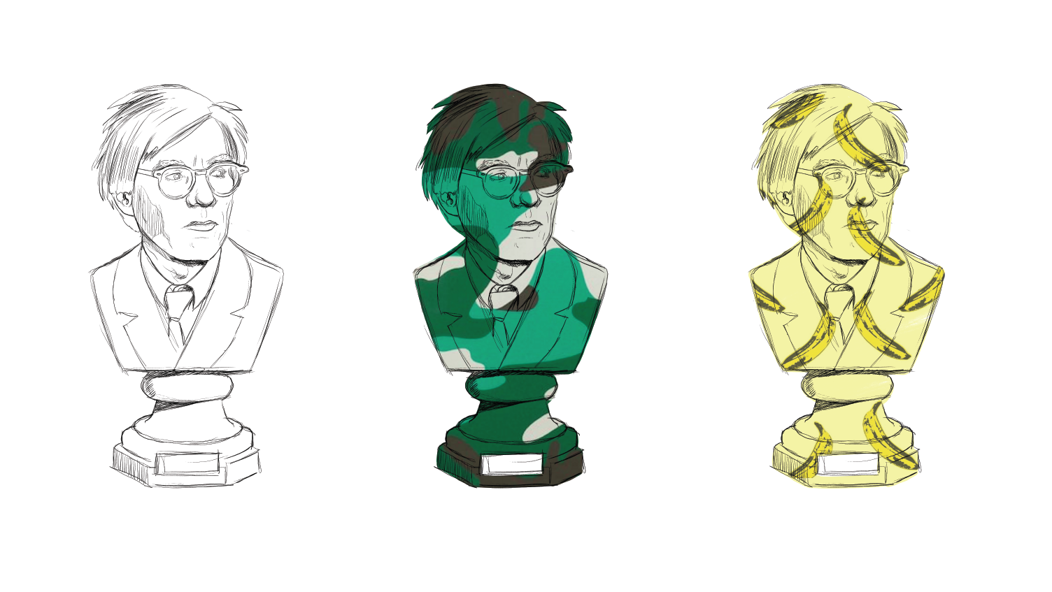
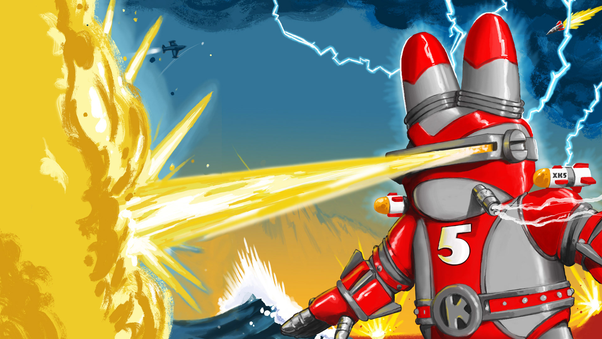
I tried to bring this approach to my illustrations for the project as well. I wanted the images to maintain the important visual history of lowrider arte, but to look new, fresh and smart. I opted for simplicity and a clean, cartoon aesthetic over the more detailed and heavy traditional style. I also kept the color palette limited to red and gray to give a connected feel to all of the pieces.
The Lowrider Bike
